When you hear the word ‘email’ you probably think of a corporate memo in a corporate, battleship-gray font. Something about as inspiring as a buying socks. Or Antiques Roadshow. Or eating a plain rice cake.
But, with the miracles of modern science, emails can be much, much more than their boring, corporate predecessors. And they need to be. In this fast paced modern world, stodgy old email simply won’t cut the mustard. People want to see the products you have. They want big, bold buttons. They want beautiful, on-brand animations. And they want it to look nice on every device they own – their phone, tablet, desktop computer and internet-connected fridge.
As luck would have it, plenty of awesome bits of software will help your company create emails that truly look amazing. We’ve discussed a few of them before over here. If you don’t have a solid email marketing and automation platform for your business, we’d strongly recommend putting this article on pause, and signing up for Klaviyo or Dotmailer today.
Sorted? Good. Now onto the fun stuff – putting your design skills to work.
Layout
Brass tacks: the layout.
The layout of your email should be your first consideration. Designers call this ‘wireframing’ – a rough sketch of what’s going to go where in the final design. There’s a few rules to consider.
- Always keep the width of your emails at around 600px. No-one wants to scroll side to side. We like to scroll down. It’s how our thumbs, scroll wheels on our mice, and eyes all work. Eye tracking tools have found that people ‘scan’ when they’re using their devices – they read quickly, trying to find the most important bits to focus on. 600px facilitates that perfectly.
- Use a content hierarchy – put the most important stuff at the top. As much as we’d like to, we can’t assume that all our subscribers will be reaching the bottom of our emails. Hit them with the most important stuff first to ensure you’re getting your message out to as many people as possible.
- Design for multiple CTAs. You don’t want to liberally pepper your entire email with buttons and links, but you do want to give readers multiple opportunities to take actions throughout. Split up your content blocks with multiple, clear calls to action.
- Ensure your email will work on both desktop and mobile. Keeping it 600px wide is a great start, but to really create a universally appealing email, you need to ensure you’re designing it with both formats in mind. Luckily, Klaviyo, Dotmailer, and other platforms all give you the ability to easily create responsive templates. These help to pour your content into different screen sizes like water from a jug to a glass. The trick is keeping this in mind during the wireframing phase.
A few key sections
Depending on your email’s purpose, you’re going to want to use (or not use) different components. Shipping notifications, for example, don’t really need a vibrant image header or a big, colourful CTA. A welcome email, on the other hand, is going to want to really lay out the red carpet for new subscribers. To introduce them to your brand in style, you’ll want to go ham with awesome, on brand content.
With that in mind, let’s take a look at some key sections to consider:
Image header
These are a great way to capture a reader’s attention from the word go. You can even use photo editing software to include some nice, bold messaging (remember to make it large enough to be seen on mobile).
Pro Tip: try adding a call to action to the header itself, and link the image to wherever you’d like to direct your subscribers.
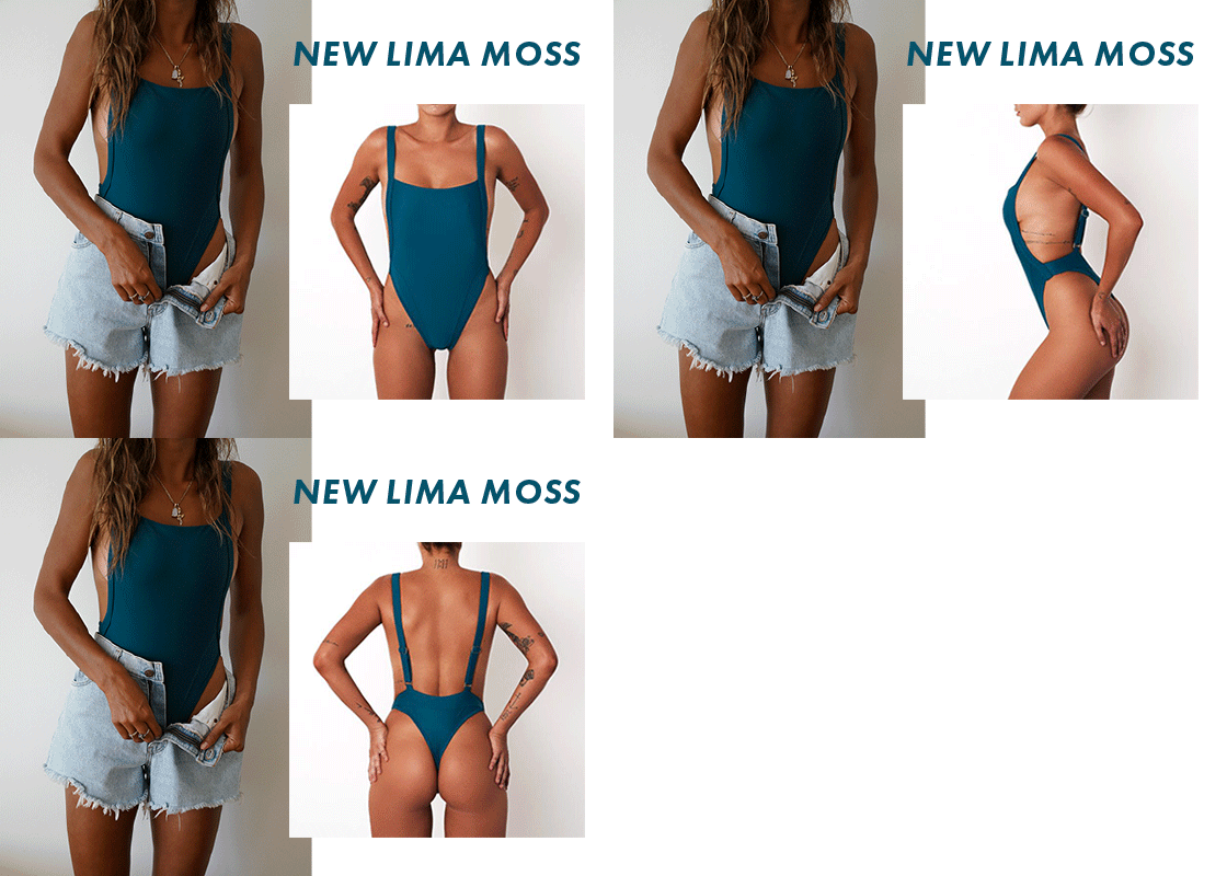
If you’re looking to spice things up even more, try using a gif. Animated email headers are a surefire way to capture the attention of your audience. Here’s an example of one of the animated campaigns we made for our client, Fae.
Introductory message
Next step, provide a little more context for your readers. A short, sharp introductory paragraph to clearly get your message across is a great way to ensure you’re reaching as many people as possible.
Pro Tip: stay with one or two paragraphs. You have precious little time!
Product cards and images
Show off your products. This is a must. Product imagery is incredibly important to ecommerce. People want to see what they’re buying.
Even better, make them gifs! Show your product from all angles.
Calls to action
Your calls to action should be direct and bold. Lure your subscribers in with great copy and imagery, and then make it easy for them to see more information, and buy.
You’re going to want to make your CTAs nice and large. Buttons used to just be a cosmetic choice – they looked fancier than a hyperlink – but given that touchscreens are now the main stage your email will be performing on, buttons are far more practical for thumbs.
Proper headers and footers
A nice header menu is a great way to give your customers multiple options. Why not link out to the different sections of your website – your different product categories for example? Similarly, you’ll want a nice, standardised footer. Email spam is, unfortunately, still a problem – so you need to ensure you’re proving your email is legit. Add your address, business details, and copyright information at the bottom of every email you send. (Plus, you’ll need to include an unsubscribe link here to properly comply with Spam Laws).
Keep it on brand!
There are innumerable opportunities in your email to brand your emails properly. Let’s take a look at some of the fundamental ways you can keep your marketing consistent.
Maintain the proper colour scheme
Our human eyes are pretty well adapted to identifying, and applying meaning to colours. It’s important. If we couldn’t, we’d be eating unripe berries and touching poisonous frogs. Evolution has hardwired our love for colour deep into our brain.
Keeping your emails in line with your colour scheme is, subsequently, super important. You want your viewers to identify this email is from YOU at a glance, and the best way to do that, is by keeping it consistent with all your other marketing materials. Your website, your product packaging, your brochures – the works.
Every element in your email should be branded with colour: from your CTA buttons, to your header text, to your dividing lines.
Use the same font
Font is incredibly important. Although serifs weren’t particularly important to the evolution of man, using the same font across all your marketing materials is still a great way to provide a rock solid, on brand experience for your readers.
If you use Georgia on your website, use Georgia in your emails. If your blog is in Times New Roman, so too should your introductory message.
Imagery
Of course, imagery also plays an important part of your email design. Make sure you’re selecting photos that you feel really represent your brand.
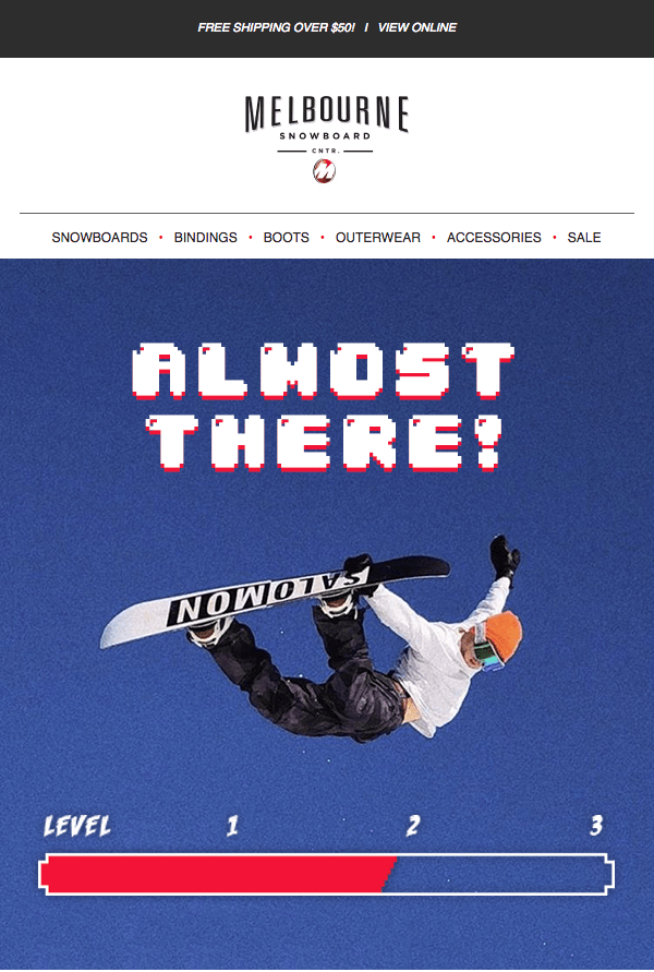
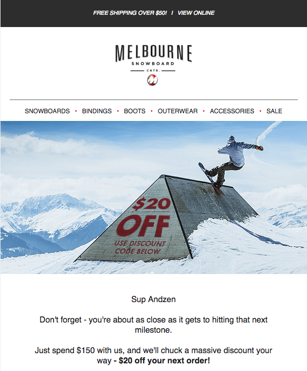
Here’s a great example from one of our clients, Melbourne Snowboard Center. Great imagery is a huge part of their marketing strategy, and so, we put their assets to work for them in their email campaigns:
Include your logo
Include your logo. Pretty obvious really. For an even more professional touch, link the image back to your website to give your subscribers a nice ‘home button’.
–
If you’re looking for something similar for your business, or you’d like to discuss how to maximise your email marketing performance through automation, we’d love to help! Get in touch today.


