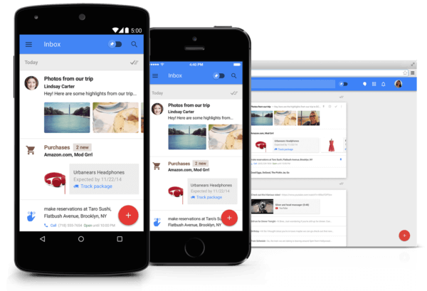
When you consider how much we use Google every day, it’s safe to say their newfound focus on ‘material design’ is set to influence public perception of what’s considered beautiful design. Google recently introduced Android 5.0 (aka Lollipop), which has been labeled as the biggest update to Android to date. Yet we all know Google is too modest to boast about it.
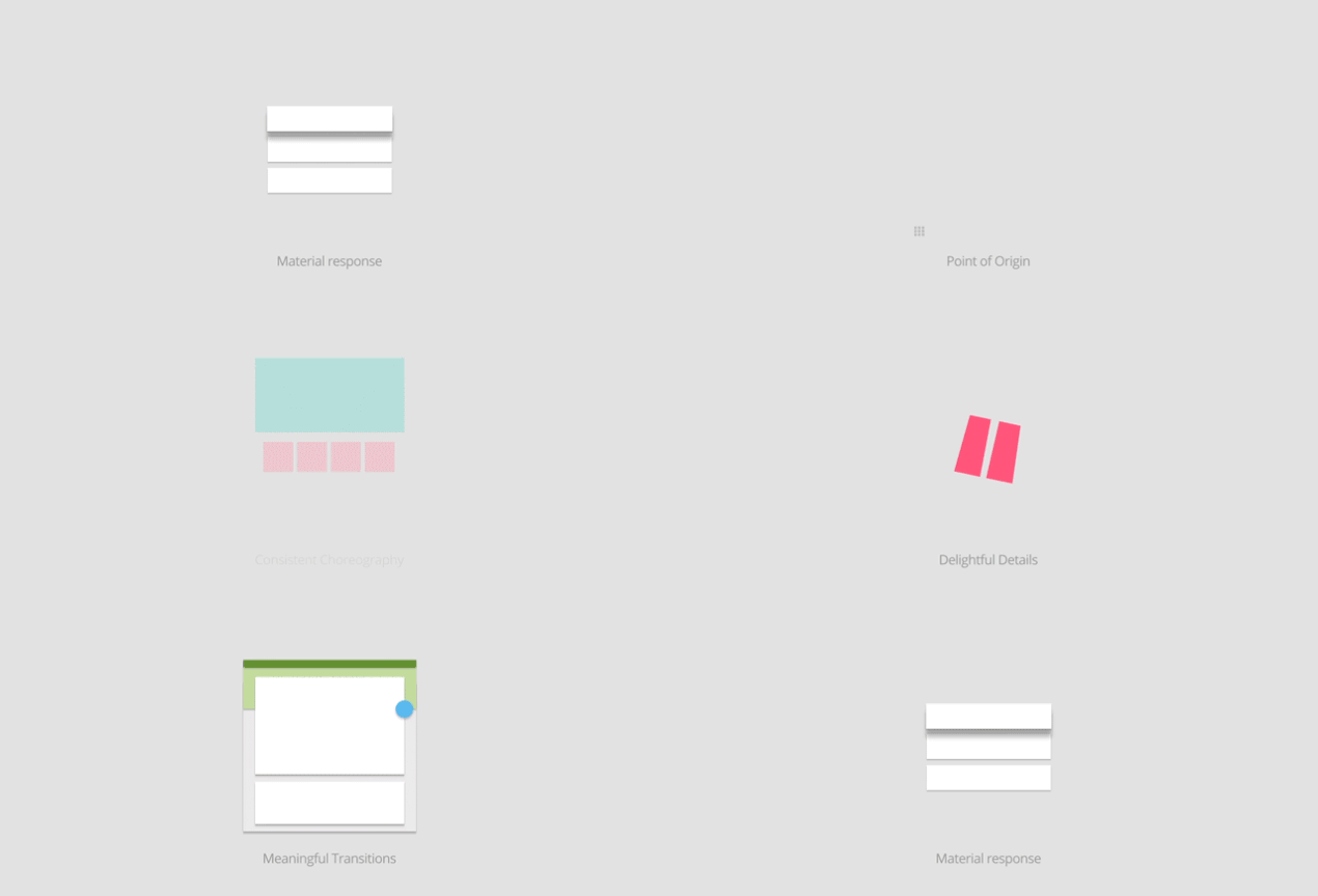
It’s great to finally see a new approach to the way we interact with user interfaces. To say material design feels refreshing on an Android device is an understatement. It’s intuitive, intrinsic and beautiful. The concept behind Google’s take on the design is based on 3 main principles: ‘Material is the metaphor’; ‘Bold, graphic, intentional’; and ‘Motion provides meaning’.
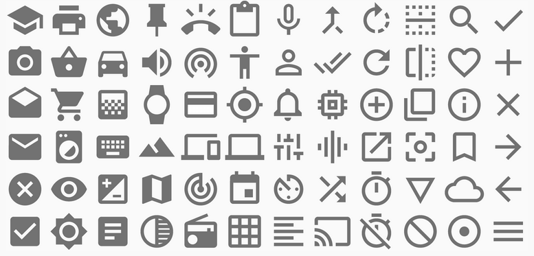
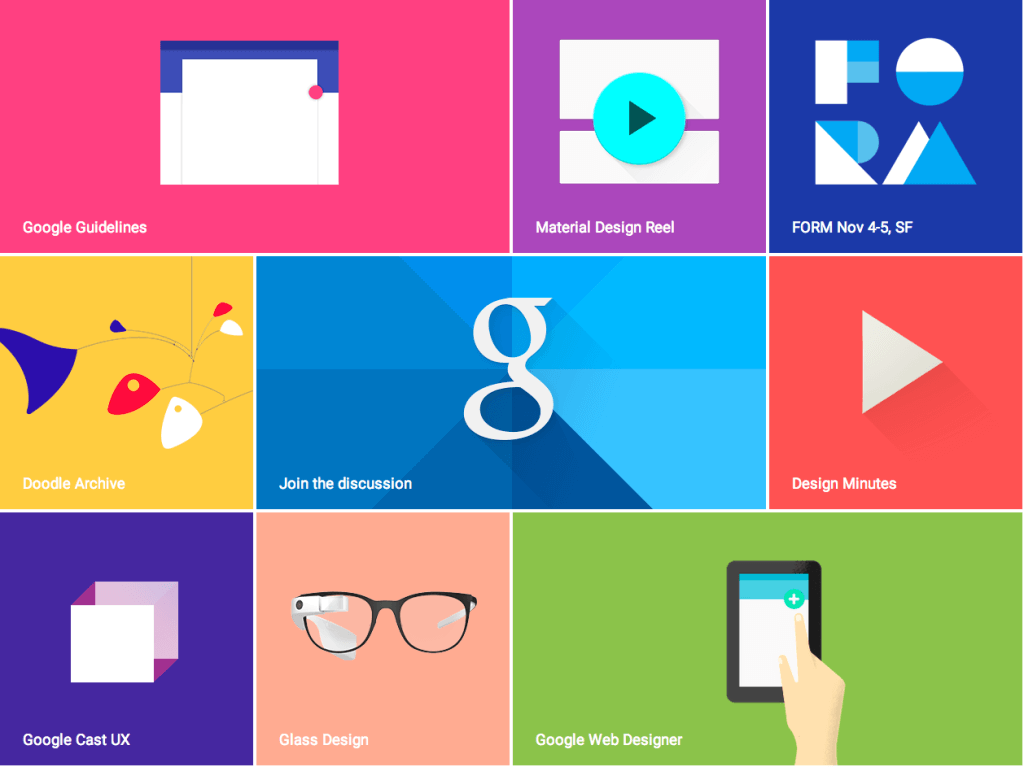
Best of all, the guys at Google have reached legendary status by offering up their design language and documentation to the public, which means we can use many of their existing assets in our email designs.
As expected, mobile responsiveness can be found in every element of material design. As you might know, the Gmail Android app strips styles out of the head of all emails, and therefore doesn’t support responsive design. But this could all change before we know it, with rumors circulating that Gmail may soon support media queries. Here’s to responsive emails in the Gmail Android app for 2015!
The future looks like a bright and colourful one. As users get more and more familiar with material design across iOS and Android, it might be time to introduce some of these design elements into your email campaigns. So without further adieu, here are my top five reasons to start using material design elements in your next email campaign:
1. Simplicity
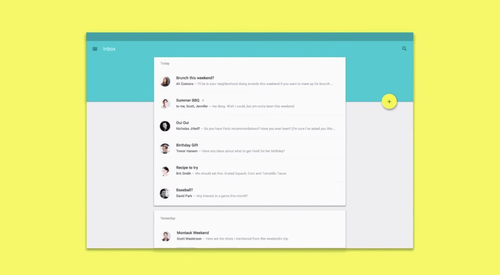
As food is the way to a man’s heart, clearly communicated concepts are the one true way to your subscribers. Although material design may appear to be just a bunch of boxes and shadows, the real beauty is in the simplicity. Good design is represented by the continuity and relationship between design elements. We as humans work with material on a daily basis and that forms a big part of Google’s inspiration for Android 5.0.
Each element is designed to represent paper and ink, a bit like all the notes scattered across your desk; except each note is ordered and has a vertical hierarchy. Although we can’t use the CSS3 wizardry flaunted by the likes of Polymer in our emails, we can still incorporate box shadows to create depth of field.
2. Mobile dominance
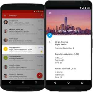
The best marketing campaigns are the ones that master the art of context. We know that more than half of all email opens occur on mobile and that most mobile platforms such as iOS and Android are dominated by material design elements. On mobile devices, we’re constantly performing actions like opening an app or sending a message.
If you take a moment and look at all the promotional emails in your inbox, you’ll see that most of them fail to blend into their surroundings naturally. Most look like promotional emails, very much like a flyer that’s about to travel from your letterbox to your rubbish bin.
If we design our emails in a way that’s more inline with the aesthetics of mobile interfaces, we stand a better chance at convincing our users to perform an action.
3. Faster download times
Material design is reliant on using bold and contrasting colours to stand out. Heavy use of detailed images will only slow down your load times, particularly if the end user has a slow internet connection.
Instead, we can use bright, vibrant colours in the form of background-color properties and simple one or two colour images. This approach also reduces your dependence on the user’s email client displaying images (which some of the major ones don’t by default).
4. Bringing back the GIF
Animated GIFs are becoming increasingly popular in email marketing. Animated content is a sure way to increase your engagement levels; however its biggest weakness is its heavy impact on file size. The good news is that if your animated GIFs adhere to material design guidelines, their file size shouldn’t be an issue.
Fortunately, stripping back all those unnecessary colours and tones is going to allow your animated GIFs to load at lightening speeds. A lower file size means you can use more GIFs, which will translate to higher engagement in your campaigns.
5. Join the rave party
It’s hard not to love the fresh look of material design. Many designers see material design as an extension of the ‘flat’ era of web design, which saw operating systems like Windows 8 and iOS use large areas of solid color and wide open spaces with a focus on typography. Others, however, believe material design is more than that.
Marc Edwards, Director and Lead Designer at Bjango says “I love the use of depth. Giving designers exact layering hierarchy and shadow sizes is great. Material seems very cohesive and thoughtful.”
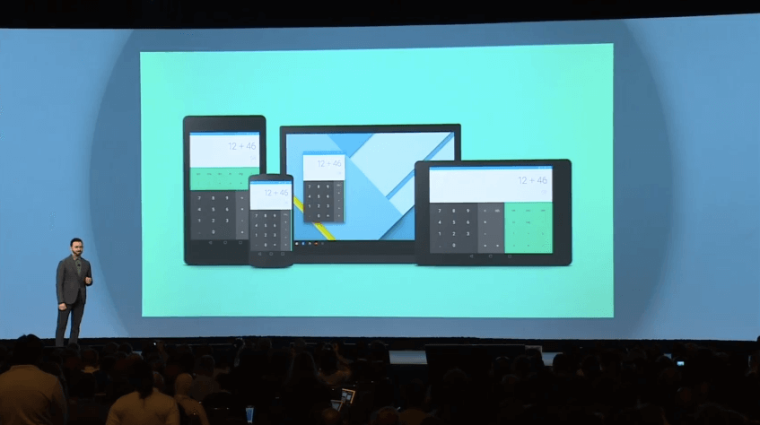
For more on Material design (if you’ve got a spare couple of hours), check out this awesome presentation video from Google I/O 2014.
