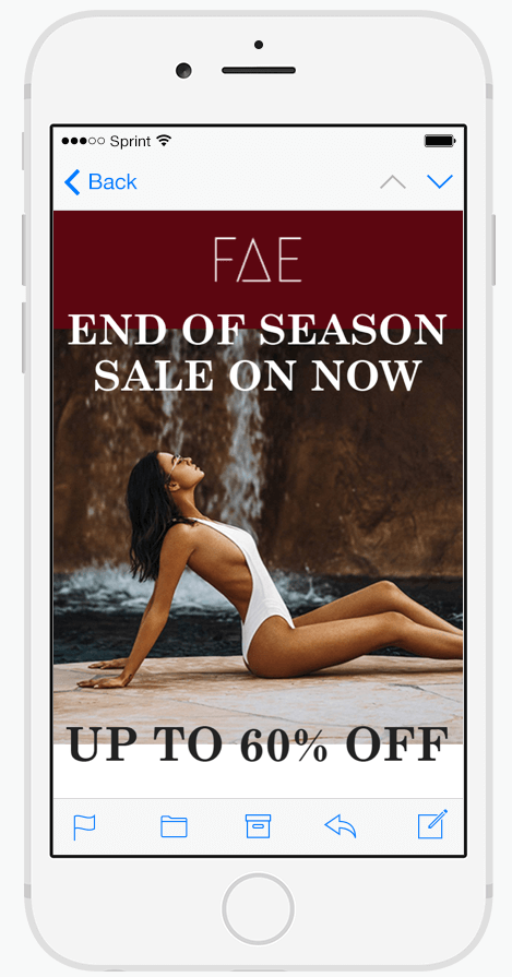
What goes into a great ecommerce email campaign? What design tips and tricks should you be using to ensure your next send shifts stock?
Let’s take a look at some of the basics – from top to tail – of an effective email campaign.
Subject Line
The subject line is the first thing a subscriber is going to see when your email hits their inbox. It’ll either make or break your campaign. No opens means no clicks, and no clicks means no conversions.
You need to draw people in, add a little mystery, and entice them to click to learn more. A good subject line has a few things:
- It’s short, and sharp. You have precious little time to work with, so get straight to the point.
- It’s on brand. Don’t completely sacrifice your voice and tone.
- It’s creative – original subject lines get more opens. Never be stale!
A few of our most highly clicked subject lines:
- “♥♥ Whoops! Did you forget something?” – Fashion brand, abandoned cart reminder.
- “New year, new pooch! Hot deals on grooming gear!” – New year sales for pet supplies.
- “Let’s get this show on the road” – Welcome email after subscription for a motoring company.
While some might shy away from certain words like ‘free’ because they think this will get their email caught in spam filters, these fears are largely baseless. Modern spam filters are a little more sophisticated, and focus more on your domain reputation than your phrasing.
Design for mobile first, desktop second
Now you’ve attracted eyes to your campaign, it’s time to think about what they’ll see when they arrive. You need to consider how people are going to be viewing your email.
Statistics show that 56% of ecommerce emails are opened on mobile. Since over half of your customers will be viewing your email on the small screen, you’re going to want to design your campaign to suit.
Many email marketing platforms allow you to customise your campaigns with responsive layouts that ensure they look great on all devices. But even when using these, you need to design with mobile users at the forefront of your mind. Any scrolling a desktop user has to do will be increased by orders of magnitude for a mobile user. Keep campaigns short and sharp!
Personalisation
Now on to the content.
You’ll have no doubt received plenty of emails that referred to you by name. This is a great, simple example of how emails can be personalised for each individual customer. But these days we can do a lot more with personalisation than just auto-fill a subscriber’s name.
Investing in a professional email marketing platform like Klaviyo or Dotmailer will allow your business to do a lot more with your campaigns. By syncing data from other sources – such as your website analytics, online store, and more – you’re able to personalise your emails on a far more powerful level. For example, suggesting products that will compliment a customer’s last purchase, or targeting discount codes only to subscribers who need a little extra push over the line.
Take a look here at our Email platform buyers’ guide!
Incentives
Most campaigns rely on some sort an offer to help incentivise your customers to buy. With modern software, these too can be customised. Plus, plenty of rules can be set in place to ensure you don’t need to worry about sending discount codes out to the world.
For example, single-use discounts are now possible with Shopify and select email marketing platforms. This allows you to create a custom discount code for each subscriber, which can then only be used once. This stops exclusive discounts running viral, or having them featured on coupon websites.
Offers don’t always have to be in the form of discounts. You can also offer free shipping, package deals, or more. The choice is up to you. And if you’re not ready to offer discounts or freebies, you can still incentive your subscribers by reminding them of the value of your products or adding some humour into your email.
Calls to Action
The last piece of the puzzle. A solid ‘Call to Action’.
Calls to Action are small pieces of content – often in the form of a link or a button – that directly stimulate the viewer to do something. You might return them to their abandoned shopping cart, take them to your website, fill in a survey, or show them a new product.
Whatever desired action you’d like your customer to take, you need to ask expressly! Don’t be afraid to be big, bold and direct.


