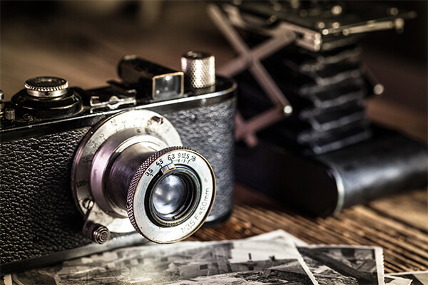
“A picture paints a thousand words.”
It’s an old adage. But there’s modern evidence to support it. It’s been estimated almost half of the nerve fibers in our brain are connected to our retinas. And while you might be wry enough to point out that we use our eyes to read, too – we still process imagery 60,000x faster than text, and visual aids have been shown to increase our chances of remembering something by 400%.
Our brains are hardwired to prefer pictures. So what does that mean for ecommerce?
Shopping online
Online shopping is fundamentally a visual experience.
Sure, you need a well-written description, and some great sales copy – but it’s your your product photos that really seal the deal. In fact, 67% of online customers claim that the quality of a product photo is ‘very important’ when making a purchase.
Makes sense, really. In a physical shoe store, you can pick up the shoe. You can view if from every conceivable angle, and even try it on. But when shopping for shoes online you simply have to take the merchant at their word. You’re at their mercy. But photos? Photos you can still trust.
The camera doesn’t lie.
So let’s look at a few imagery best practices for ecommerce websites.
Provide multiple photos from different angles
For the vast majority of your stock, you’ll want to ensure you’re showing it off from every angle.
For the best website design and user experience, pick a set number of photos to include for each product. The amount you choose will vary depending on the price and complexity of your product range, but as a general rule, most ecommerce websites should be fine with 3-4.
Show all different colours and variations
If you’re selling different styles or colours of the one product, you’ll want to make sure you’re showing them all.
Recently, when buying pillow cases online, I found a website that sold the same style of sheets in 12 different colours, but only had photos of the white variant. To make things worse, they didn’t even show the colours – rather, they wrote the names of the colours in a drop-down menu. You could buy sheets in vague shades such as ‘charcoal’ and ‘linen’, but had no idea what they would look like until, presumably, they arrived in the mail.
I find it incredibly unlikely any ‘linen’ coloured sheets have ever been purchased from this website.
If you’re selling multiple colours and styles, ensure you have photos for them all!
Show your products in use
While it’s good to to keep things minimal, and have product focused, zero-background images of your products, you might also like to consider including a few ‘life shots’ that show your products in use, or flaunt their benefits.
Show your kitchen utensils in use, your sheets set up in a bedroom with matching decor, and your shoes braving whatever terrain they’re designed for. Highlight the product’s best features, and/or the lifestyle they’re created to enhance. Connect with your customers’ emotions and show them how they can use your products to improve their daily life.
Some inspiration for your brand
Here are a few examples of some incredible photography from a few of our clients:
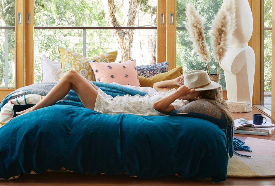
Our client Sage and Clare have an incredible photography focus, and do some truly amazing work. Their photoshoots can last full days. Just take a look at this shot – this was used on their website, and also to show off their new Barrku Collection in Real Living Magazine.
Sage and Clare have a real focus on showing the lifestyle that their products support in their images. This helps the viewer gain a truly emotional connection to their products and brand.
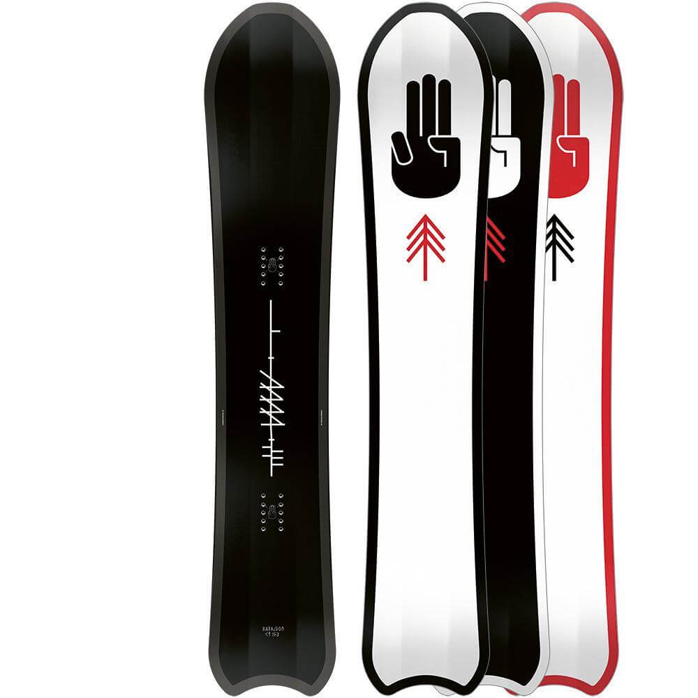
Here’s a great shot from our client Melbourne Snowboard Centre.
To keep in line with their website’s product page design, this photo has been cleverly edited to show off all the colour and style variants of one their Bataleon CT board.
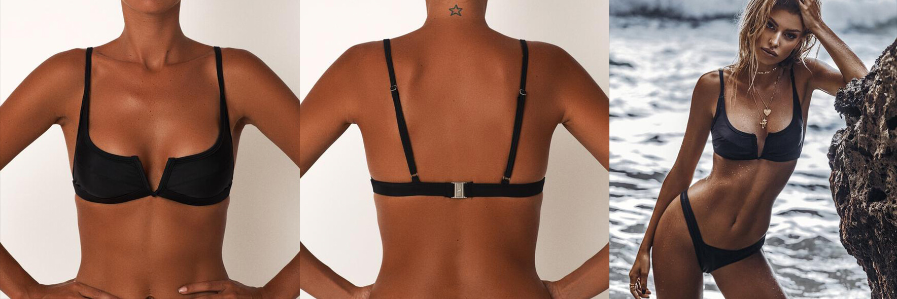
As a fashion label, on of our client Fae’s main priorities is their imagery.
As well as awesome product photos, Fae regularly conduct photoshoots with their models to show their swimwear out on the wild. Here you can see their product photos, and a supporting lifestyle shot of their Gypsy range. These work well together: the product photos help the customer see the product in detail, while the lifestyle shots help to build up their brand, and create an aspirational element to their marketing materials.
The bottom line
If you want to ensure your ecommerce business is moving as much stock as possible, you’ll want to invest in great photography.
